It is not a comfortable conversation, but it is a real one. Mid-size distributors, the kind managing between 500 and 2,500 titles, are evaluating submissions constantly. The key art is not just decoration. It is a signal.
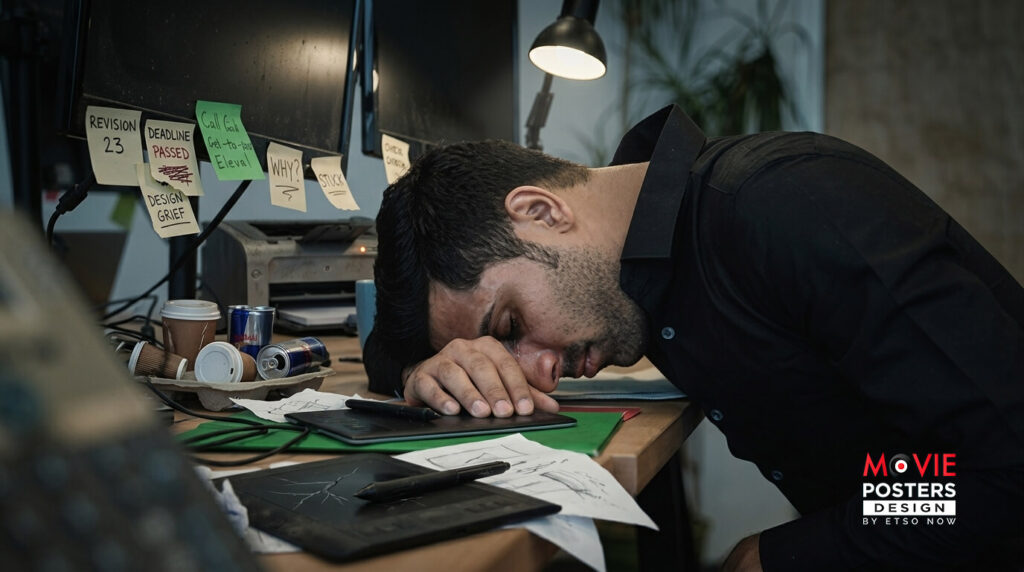
When the poster looks like it was assembled from a stock photo and a free font, it tells a buyer something about how seriously the filmmaker approached the project as a whole. Right or wrong, that impression shapes the conversation before a single frame of the film is watched.
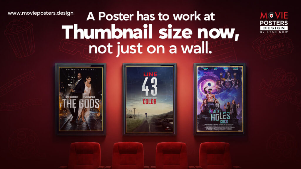
The flip side is equally true. Strong, well-crafted key art opens doors. It communicates that someone on this project understood their audience, their genre, and their market. Distributors notice that.
This is precisely the gap that Movie Posters Design was built to close for independent filmmakers and smaller distribution companies. We bring the same level of craft and strategic thinking to indie key art that the major studios take for granted on every release.
You do not need a Hollywood budget to have Hollywood-quality artwork. You need the right team.
We are in Los Angeles and we are accepting new clients. www.movieposters.design