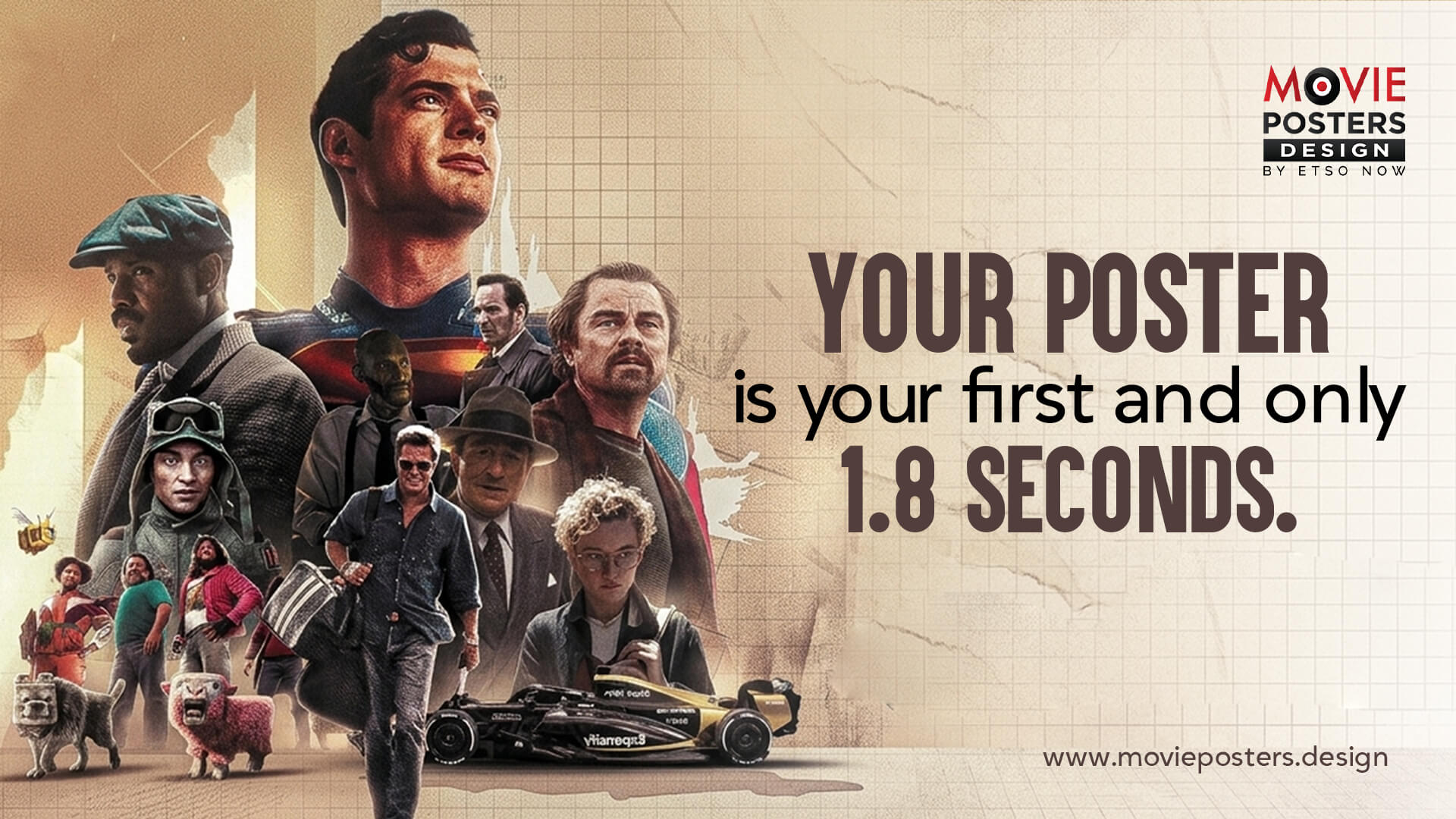
Netflix’s own research puts it plainly: viewers decide whether to engage with a title in 1.8 seconds, and the poster is the single biggest factor in that decision. Not the description. Not the reviews. Not the trailer. The image.
That number should be pinned to the wall of every distribution office in the country.
We have watched films with genuinely compelling stories disappear into streaming catalogs because the key art did not stop anyone in that window. And we have watched modest films punch well above their weight because someone invested in artwork that communicated genre, tone, and intrigue at a glance.
For distributors managing catalogs of 500 titles or more, this is not a small problem. It multiplies across every single release. Weak key art is not just an aesthetic issue. It is a revenue issue.
Movie Posters Design works with distributors, FAST channels, and indie filmmakers who understand that the poster is not the last thing you think about. It is the first thing your audience sees.
We are based in Los Angeles and we would love to show you what a difference the right key art makes. www.movieposters.design
