I remember the first time I came across the Silence of the Lambs movie poster. When I noticed the details, I was blown away. I loved the fact that the skull on the back of the moth that covers Jodie Foster’s mouth is actually a photo of naked women, “In Voluptas Mors.” Apparently it was something that Salvador Dali (one of my favorite artists) did and it was shot by Philippe Halsman.
The other thing I learned about the poster was that the moth it depicts is real – in the sense that death’s-head hawkmoth is a real type of moth which is found primarily in Europe. It looks like it actually has a human skull on its back. I have seen this a whole lot in different moths. Another great example of their uniqueness is the Atlas moth which looks like it’s got snakes on its wings. Very fascinating stuff. We could go on and on about moths, but I digress.
The point I am trying to make is this: From Silence of the Lambs to Moonlight, a good film poster can be a tremendous work of art as the movie it is selling or depicting. This being the case, why is it that I have come to find so many rather underwhelming posters in recent years?? Why are so many modern posters so lackluster and devoid of actually storytelling and creativity?
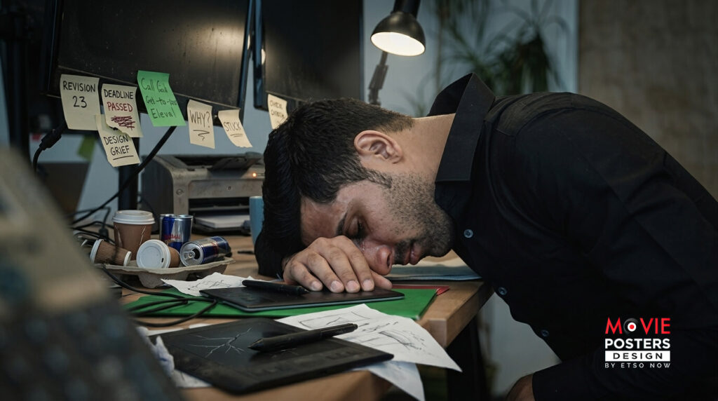
Sometimes it boils down to too many decision makers. You have the Directors, Marketing teams, Producers, and a whole list of other people giving input on how everything needs to be and look like including the Designer. In addition, deadlines need to be met in order to meet all the demands. In the process of reconciling all the ideas, the final product tends to suffer at the end. It’s a slew of factors, really.
This is something that is recognized but there is hope. Today, we have independent creators and designers creating alternative artwork. Forms of distribution has changed. The market is such that creators and distributors collaborate with third parties like us (Movie Posters Design), where we make an actual effort in creating something backed by thorough research and care. Our designers love to create unique key-art and make changes in the right direction. In essence, bringing back creativity, storytelling, unique feature and colors to posters that people will look at and think back to the iconic images like Silence of the Lambs.
We think this is exciting and we would love to show you more.